


Psychological significance
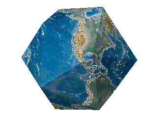
Map of Europe, showing south at the top
Research suggests that north-south positions on maps have psychological consequences. In general, north is associated with richer people, more expensive real estate, and higher altitude, while south is associated with poorer people, cheaper prices, and lower altitude (the "north-south bias"). When participants were presented with south-up oriented maps, this north-south bias disappeared.
Researchers posit the observed association between map-position and goodness/badness (north=good; south=bad) is caused by (i) the convention of consistently placing north at the top of maps, and (ii) a much more general association between vertical position and goodness/badness (up=good, down=bad), which has been documented in numerous contexts (e.g., power/status, profits/prices, affect/emotion, and even the divine).
Common English idioms support the notion that many English speakers conflate or associate north-with-up and south-with-down (e.g., "heading up north" or "down south"), a conflation that can only be understood as learned by repeated exposure to a particular map-orientation convention (i.e., north put at the top of maps). Related idioms used in popular song lyrics provide further evidence for the pervasiveness of "north-south bias" among English speakers, in particular with regard to wealth. Examples include, using "Uptown" to mean "high class or rich" (as in Uptown Girl by Billy Joel), or using "Downtown" to convey lower socioeconomic status (as in Bad, Bad Leroy Brown by Jim Croce)
McArthur's Universal Corrective Map of the World, 1979

Working locations for the last 24 hours
25°17'16.2"N 51°32'39.9"E
25°15'38.9"N 51°31'28.1"E

George Baselitz

Ireland, 2017


It is completely artificial that we have North at the top of a map. The convention came a few centuries ago when Northern hemisphere, European navigators started using the North star and the magnetic compass. Before that, the top of the map was to the East which is where the word orientation comes from.


What's Up? South Map


The orientation of our maps, like so many other features of the modern world, arose from the interplay of chance, technology and politics in a way that defies our desire to impose easy or satisfying narratives. But at a time when the global south continues to suffer more than its share of violence and poverty, let’s not dismiss McArthur’s Universal Corrective Map of the World too quickly. It continues to symbolize a noble wish: that we could overturn the unjust political and economic relationships in our world as easily as we can flip the maps on our walls.


......